The Art of the Elevated Print: Why the Human Hand Still Wins
In a market saturated with digital precision, the prints that truly resonate, the ones that really feel "premium" rather than transient, to me, share a common thread: the presence of the human hand. For designers, directors and buyers, choosing a print isn't just an aesthetic choice; it’s a commercial one. Here’s a look at how I approach my work to ensure every design offers both beauty and brand longevity.
1. The Soul of the Hand
There is a profound difference between a print that is just "designed" and one that is really crafted. Hand-painted artwork carries subtle variations, natural movement, and those intentional (or unintentional!) irregularities that digital tools often smooth away.
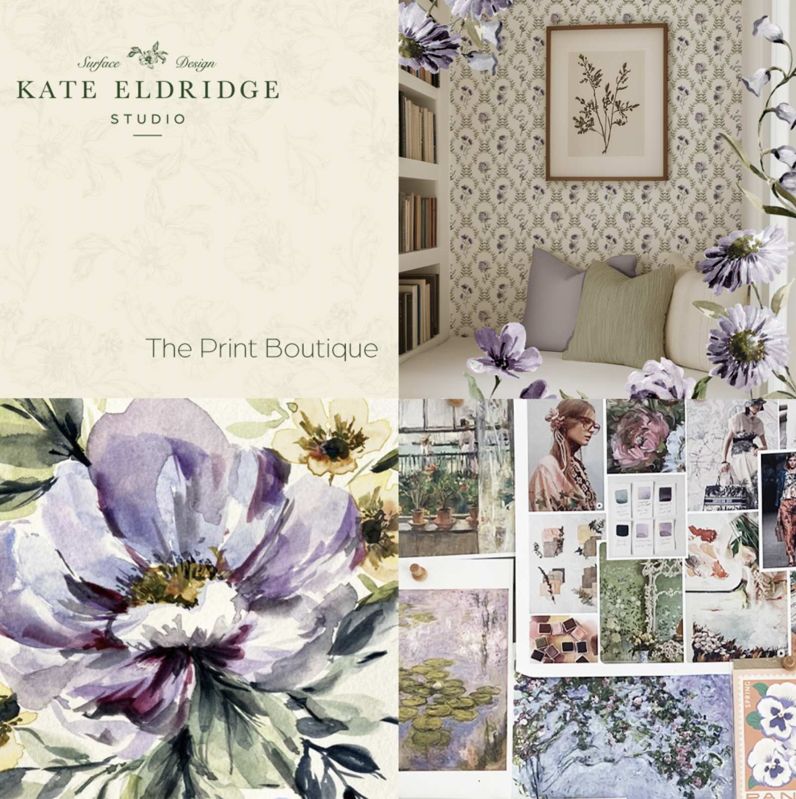
These nuances create a sense of "quiet luxury." Customers may not always be able to name why a hand-painted watercolor feels more expensive than a digital vector, but I feel like they respond to that tactile, human connection instinctively.
2. Color Depth Over Color Noise
Premium prints rarely rely on loud, overcrowded palettes. Instead, they find power in tonal restraint. By focusing on depth through layering and thoughtful contrast rather than sheer volume of color, a design gains a timeless quality. This approach allows a print to age gracefully within a collection, making sure it feels like a curated piece and not just another trend.
3. The Power of Intentional Intricacy
There is a common misconception that "premium" must mean "minimal." In reality, a dense, highly detailed print often carries the highest perceived value because it rewards the viewer's attention. When a print is rich and layered, it tells a story; the customer discovers something new every time they look at it.
The key to a successful dense print is rhythm. Even in the most intricate designs, there must be a flow that guides the eye across the fabric. I focus on creating "visual pathways" that allow a busy print to feel cohesive and sophisticated rather than chaotic. This level of detail is what transforms a garment or wallpaper design into a statement piece that stands out on a retail floor.
4. The Commercial Edge: The "Hero Print" Advantage
In a retail environment, these intricate, hand-painted details aren’t just aesthetic choices—they are strategic tools that directly impact your bottom line:
Unrivaled Stoppage Power: Dense, romantic prints act as "anchor" pieces for a collection. Their complexity creates immediate visual interest that captures attention in a crowded market, driving both digital clicks and in-store engagement.
Design Protection: Hand-painted watercolor textures are notoriously difficult to replicate. Unlike flat, digital vectors, the organic "bleed" of paint and the density of my designs offer a level of exclusivity that protects your brand from low-tier imitations.
Justified Premium Pricing: There is a direct correlation between perceived labor and perceived value. When a customer sees the meticulous detail of a hand-rendered design, the "value prop" is clear, allowing for healthier margins and higher pricing tolerance.
Seasonal Longevity: While trend-led "filler" prints date quickly, hand-painted artistry has a timeless quality. These prints often have a longer shelf-life within a range, reducing the need for early markdowns.
How this thinking shows up in my studio
In my own practice, I merge a romantic, feminine sensibility with a rigorous eye for industry standards. Whether it’s a delicate watercolor floral or a textured abstract, my goal is to provide you with artwork that doesn't just fill a gap in a range—it elevates the entire collection.
Ready to see the latest collection? I invite you to apply for access to explore my latest hand-painted designs curated specifically for industry professionals.