What Makes a Print Feel High Quality
There’s a certain feeling you get when you see a print that looks… expensive. It’s not loud. It’s not trying too hard. But the quality is obvious. As someone who paints and designs patterns for fashion and home, I notice the little things that create that feeling — and they usually happen long before a print ever hits production. Here’s what I look for, and what I try to build into every design I create.
1. Authenticity
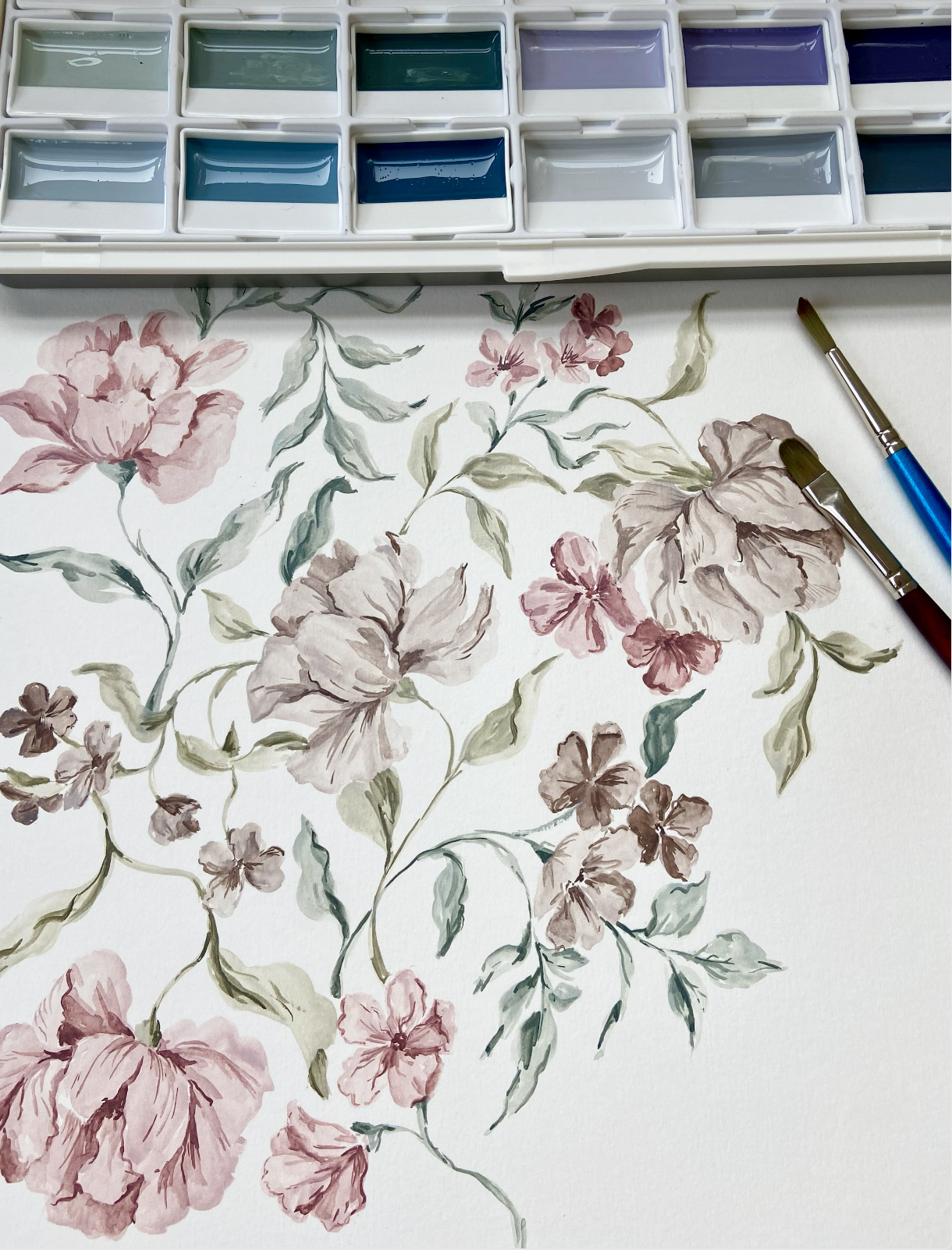
Hand-painted work has a certain weight to it — not physically, but visually. You can tell when a brushstroke was confident versus maybe not so much.
This is the part no AI can fake, and where hand-painted art really shines. For the timebeing, there’s definitely a certain look or ‘feel’ to non human art which (to me!) looks a little cheap.
The more the industry moves toward digital shortcuts, the more obvious genuine artistic detail becomes.
Tiny inconsistencies, human rhythm, subtle imperfections, are not really flaws. They’re kind of what make a print feel alive, and high-end and authentic.
You can’t replicate it with a filter. You can try, but it always ends up looking slightly uncanny.
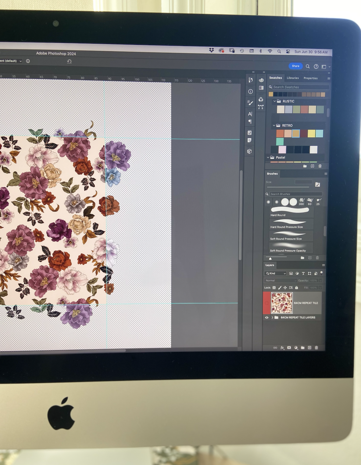
2. Clean, Thoughtful Editing (No Ghost Pixels, No Pencil Lines)
This is a really important one to me and something I’ve found a lot of designers overlook.
But trust me: the eye picks up sloppiness even when the brain doesn’t.
Things that cheapen a print immediately:
faint pencil marks left in the scan
blurry edges from rushed cleanup
messy cutouts
artefacts from resizing
sections of the repeat where the texture suddenly changes
ghost pixels
When artwork is cleaned properly — edges crisp, textures consistent, colors intentional — the final print looks polished and premium, even before it’s ever indexed or separated for production.
This is the invisible work that makes a huge difference.
3. Color That Feels Considered, Not Random
Most “expensive” prints have a very quiet kind of color harmony.
It’s not matchy-matchy — but very deliberate.
What helps:
a clear anchor color
supporting tones instead of competing ones
adjusted saturation so nothing screams unnecessarily
a bit of depth (muted tones often feel richer than flat primaries)
Even bolder palettes can feel high-end if the colours feel balanced rather than thrown together.
This is why recolouring is such an art in itself, it’s not just sliding the hue bar and hoping for the best.
4. Consistency Across the Repeat
A seamless repeat should feel effortless, which, ironically, takes a lot of effort.
Signs of a premium print:
no accidental “hotspots” where everything clusters
no awkward empty voids
motifs that transition naturally across edges- small details like, hidden stem ends on flowers make a difference.
even flow, but without looking tiled or mechanical
When a repeat feels calm and intentional, it instantly elevates the design.
5. A Sense of Depth (But Not Chaos)
Expensive prints often have layers — but they’re not messy.
Depth can come from:
variation in brush pressure
subtle texture
a shift in opacity
foreground vs. background motifs
Contrast within details like petal leaves
Color depth within your actual motifs
6. Artwork That Doesn’t Fight With Itself
This is a big one.
You can paint beautiful motifs, but if they don’t feel like they’re part of the same world, the print can look inexpensive. Luxury prints have a sense of cohesion, like all the elements were painted in the same breath.
That doesn’t mean they match perfectly. Just that they feel like they were created by the same hand, in the same moment, with the same intention.
Luxury in print design doesn’t come from complexity.
It comes from clarity — clear decisions, clean artwork, and a sense of intention from the very first mark to the final repeat.
If you’re working on upcoming collections and want thoughtfully hand-painted prints to explore, I’m always here to chat through options. Get in touch here